
Free Instagram Grid Maker– When a user visits an Instagram profile, the immediate impression forms within seconds. A standard feed presents disparate images, but a structured layout transforms individual uploads into a massive mosaic. We discovered early in our content planning that splitting high-resolution images into multi-tile grids increases profile dwell time, encourages exploration, and establishes professional aesthetic authority.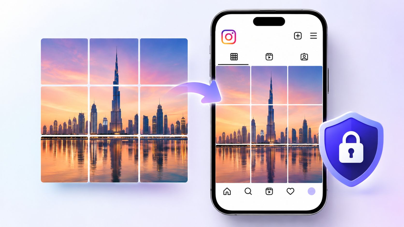
Whether highlighting a brand campaign, revealing a product, or building a panoramic landscape, using an online photo splitter removes the guesswork from dividing images manually. Maintaining exact pixel precision prevents blurry seams, misaligned margins, and distorted profile views.

Step 1: Uploading High-Resolution Source Media
The success of any multi-panel split depends on the baseline image quality. When an image is sliced across three, six, or nine separate squares, every individual tile magnifies compression artifacts.
-
Select Uncompressed Originals: Always export the original image in full resolution. Using heavily compressed web files results in pixelated tiles when viewed in full screen.
-
Import Directly: Drag and drop the master image directly into the grid maker canvas or select it from local storage.
-
Verify Canvas Clarity: Ensure that facial features, typography, and contrast points remain sharp before locking in the slicing dimensions.
Step 2: Choosing Your Feed Architecture
Grid planning requires understanding how profile columns behave. Instagram natively organizes feeds into three vertical columns. To create a cohesive design, select a structure that aligns with your publishing schedule and audience expectations:
-
The 3×3 Mega Grid (9 Tiles): The classic puzzle look. This turns the entire viewport of a mobile device into a single, cohesive banner. It works best for major launches, album releases, or portfolio resets.
-
The 3×1 Horizontal Banner (3 Tiles): A single row across the profile. This approach cleanly divides themes, collections, or visual seasons without requiring an overwhelming number of posts.
-
The 3×2 Rectangle (6 Tiles): A balanced option that occupies two full rows. It delivers scale without cluttering follower feeds with nine sequential uploads.
-
Seamless Multi-Slide Carousel: Instead of slicing for the main feed, slice a wide panoramic image horizontally to create an uninterrupted swipeable carousel.
Step 3: Aspect Ratio and Safe-Zone Alignment
Modern profiles render content across varying device viewports and aspect ratios. Choosing the right aspect ratio ensures that your images look intentional both in the feed and when viewed individually:
-
Square (1:1 Ratio): The traditional grid standard (1080 x 1080 pixels per tile). This guarantees uniform square cropping across legacy displays.
-
Portrait (4:5 Ratio): Optimized for modern vertical viewing (1080 x 1350 pixels per tile). Slicing in portrait orientation maximizes mobile screen real estate when followers open individual posts.
-
Safe-Zone Alignment: Position key subjects, faces, and text away from slicing cutlines. If a cutline runs directly through a person’s eye or a brand logo, adjust the vertical or horizontal alignment sliders before exporting.
Step 4: Exporting Slices with Numbered Metadata
Once the alignment is finalized, download the rendered tiles. A dedicated grid tool automates the naming convention to prevent publishing errors:
-
Batch Download: Select the single ZIP download option to keep all generated tiles organized in a unified folder.
-
Verify Sequential Numbering: Ensure every file contains an automated numerical suffix (such as
tile_01.jpg,tile_02.jpg). -
Inspect Seams: Open adjacent tiles locally side by side to confirm that edge pixels line up seamlessly before uploading to Instagram.
Step 5: Publishing in Reverse Chronological Order
The most common mistake when posting a grid layout is uploading tiles in forward order (starting with Tile 1 at the top left). Because Instagram places the newest post at the top left of the profile grid, you must upload in reverse order:
-
Begin with the Bottom-Right Tile (Tile 1): This post sits at the bottom right corner of your completed layout.
-
Follow Numerical Order: Proceed with Tile 2 (bottom middle), Tile 3 (bottom left), continuing sequentially upward.
-
Finish with the Top-Left Tile: The highest-numbered tile must be posted last, securing the top-left position and completing the puzzle.
-
Publish in a Single Session: Upload all tiles consecutively. If standard posts are published midway through the process, the grid shifts out of alignment.
Maintaining Long-Term Grid Symmetry
A multi-tile grid remains visually aligned only as long as future posts are managed systematically. Because every new post pushes existing content one slot to the right, a 3×3 grid will break if single images are uploaded afterward.
To keep your grid intact:
-
Post in Multiples of Three: After completing a grid, upload subsequent content in groups of three. This moves the entire grid down by exactly one full row, preserving its internal alignment.
-
Use Profile Pinning: Use Instagram’s pin feature to anchor specific rows or banners to the top of your feed, keeping key visuals front and center.
-
Plan Archive Rotations: Once a promotional campaign concludes, archive the nine tiles simultaneously to return your feed to its standard single-post rhythm.
Frequently Asked Questions
What resolution should I use before splitting a photo?
Use an image that is at least 3240 pixels wide for a three-column grid. This ensures each individual sliced tile maintains a crisp 1080-pixel width.
Why did my grid misalign after posting a new picture?
Instagram organizes feeds in rows of three. Adding a single new post pushes every tile one space forward, breaking the vertical alignment. Post in multiples of three to keep the layout intact.
Can I slice photos into vertical carousels instead of profile grids?
Yes. Set the tool to horizontal carousel mode to slice an ultrawide panoramic photo into sequential 4:5 or 1:1 slides for a single, swipeable post.
Will individual grid tiles confuse followers on their home feeds?
Individual abstract tiles can confuse users scrolling through their feeds. To maintain engagement, ensure each tile works as a standalone composition, or add context in the post caption.
What is the best aspect ratio for modern feeds?
Portrait 4:5 ratio offers the best mobile presentation, filling the screen when viewed directly while maintaining standard center cropping on the profile grid.
Does an Instagram grid maker lower image quality?
High-quality browser-based splitters process raw pixel data directly on your device canvas, preventing the compression artifacts often caused by cloud re-encoding.
How do I prevent lines or seams between tiles?
Export your source image at exact 1:1 or 4:5 multiples without borders. Ensure that no extra framing, drop shadows, or white borders are added during export.
Can I pin grid tiles to keep them at the top of my profile?
Instagram permits up to three pinned posts. This works for a 3×1 horizontal banner (pinning tiles in reverse order), but a 3×3 layout cannot be fully pinned.
Is an account required to use browser-based grid tools?
Client-side grid tools run directly via your web browser’s local processing engine, requiring no user accounts, subscriptions, or remote server uploads.
What should I write in the captions of individual grid tiles?
Include clear context in each caption (e.g., “Part 3 of 9 of our new campaign”) along with a call to action directing followers to view the full picture on your main profile page.

Selva Ganesh is a Computer Science Engineer, Android Developer, and Tech Enthusiast. As the Chief Editor of this blog, he brings over 10 years of experience in Android development and professional blogging. He has completed multiple courses under the Google News Initiative, enhancing his expertise in digital journalism and content accuracy. Selva also manages Android Infotech, a globally recognized platform known for its practical, solution-focused articles that help users resolve Android-related issues.





Leave a Reply